Autumn Newsletter- Mastering the Art of Mixing Patterns and Prints in Interior Design

Mastering the Art of Mixing Patterns and Prints in Interior Design

Mixing patterns and prints might be second nature to most designers but it can feel daunting to many so to help shed some of the mystique that shrouds it I’ve broken down the process and key concepts for those who are keen to experiment with incorporating pattern and print in their own homes but aren’t sure where to start.

Identify your preferred pattern styles

Before diving into patterns and prints, it's essential to establish the kind of patterns you’re drawn too. Patterns broadly fall into the types outlined below:

·      Stripes & checks

·      Animal prints

·      Geometrics

·      Botanicals

·      Florals

·      Tribals

·      Abstracts

Once you have a good steer on these preferences you can move onto the next step.

Choose a Colour Palette

Selecting a cohesive colour palette is the next step to mixing patterns successfully. Stick to 2-3 main colours with a background or base shade to ground the scheme. For instance, if you love blues and greens, you can mix these shades with a neutral base like white, beige, or grey. Going one step further you can then add an additional colour to the mix to offset the combination, either with a punchy contrasting colour, or perhaps a tonal colour to meld together the blues and greens. The key is to ensure that all the patterns share at least one or two of the chosen colours to tie everything together.

If you’re especially nervous about clashing colours, opt for tonal schemes which incorporate varying shades of the same colour. This approach offers will add interest in a subtle way and can be layered upon later if your confidence in mixing patterns increased and you fancy experimenting with a bolder look.

Mix Different Scales of Patterns

One of the most important aspects in successfully mixing patterns is to vary the scale of the prints. This means pairing large-scale patterns with medium sized and smaller ones. For example, if you have a large scale botanical wallpaper, balance it with a smaller, more streamlined pattern like a stripe. This variation prevents the patterns from competing and allows each to stand out in its own way.

  • Large Scale: Think big florals, wide stripes, or oversized geometric shapes. These are primarily used on larger surfaces that make a statement, like an area rug, wall covering, or a large piece of art.

  • Medium Scale: These can include slightly smaller designs like mid-sized tribal or geometric prints. This scale is typically well suited to medium sized surfaces like larger items of upholstery and window treatments but can also be used to great effect on smaller items like soft furnishings such as cushions and throws.

  • Small Scale: Think small dots, subtle stripes, or delicate floral patterns. These are great for smaller accessories like lampshades, but can also be fantastic on larger surfaces e.g. a small scale patterned wallpaper layered with medium scale fabrics in the room.

Mix Different Pattern Types

Now that you’ve identified your pattern and colour preferences and have a steer on how to combine different scales the next step is to mix a combination of your favourite types of patterns, e.g. tribals with geometrics, to give your room interest and personality.

As a basic guideline:

  • Stripes & checks: Classic and versatile, stripes work well with almost any other pattern and can add a touch of order and symmetry.

  • Florals: These add a soft, organic feel and pair beautifully with more structured patterns like stripes and geometrics.

  • Geometric Patterns: Modern and bold, geometrics can range from symmetrical art deco and mid-century motifs to the softer, painterly geometrics seen on block print linens.

  • Animal Prints: For a touch of the exotic, animal prints like leopard or tiger can act as neutrals, bringing texture and a sense sophisticated flamboyance to a space.

  • Tribals:  For those keen to add well-travelled, worldly charm tribal prints are a fantastic way to introduce a sense of diversity and cultural curiosity. There is also an inherent imperfect hand-crafted quality that typically adds a relaxed feel to schemes.

Play with Texture

Texture is another important layer of interest when mixing patterns and prints. A textured material, like a knitted throw, velvet cushion, or rattan basket, adds a tactile element that complements and enhances printed fabrics. Even if the patterns are bold, incorporating texture can ground the design, making the space feel warm and cohesive.

Balance with Solids

Solids act as the “breather” in a room filled with patterns. Incorporating solid-coloured elements, such as a plain sofa or solid drapes, helps to balance the visual intensity.

Layer Patterns Gradually

If you’re new to mixing patterns, start slowly. Begin with one patterned piece, such as a rug or a set of cushions, and then build from there. Gradually layer in additional patterns through smaller accessories until you achieve the desired look. This approach allows you to make adjustments along the way without feeling overwhelmed.

Trust Your Instincts

Ultimately, interior design is an expression of your personal style. While guidelines such as these can hopefully help encourage experimentation, the most important rule is to trust your instincts even if that means breaking from traditional dogma. Similarly to art, it’s important to understand the foundational principles and theories that underpin prescribed approaches in order to gain the confidence to play with and subvert formulaic approaches in favour of more instinctive ones guided by your own innate, if somewhat hidden or unrealised, sense of style.

In short, if a combination feels right to you, go for it! Take risks, experiment, and have fun with the process!

The Hidden Pearl/ In Conversation with Société magazine


THE HIDDEN PEARL

Following in the tradition of my slightly tongue in cheek project names, I’ve nicknamed my latest project, the renovation of my own home, ‘ The Hidden Pearl’, as to be perfectly blunt, the flat had been rather neglected when I got my mittens on it and needed a bit of a polish! I often joke that I love a challenge which is surely proof that you have to be careful what you wish for! Hehe. But as they say, 'No grit, no pearl.'

Take a peek at a couple of the finished spaces below, followed by a more in depth look at some of the personal pieces in my home. And last but not least read a little preview of my recent conversation with Société magazine which will be published in full later this week.


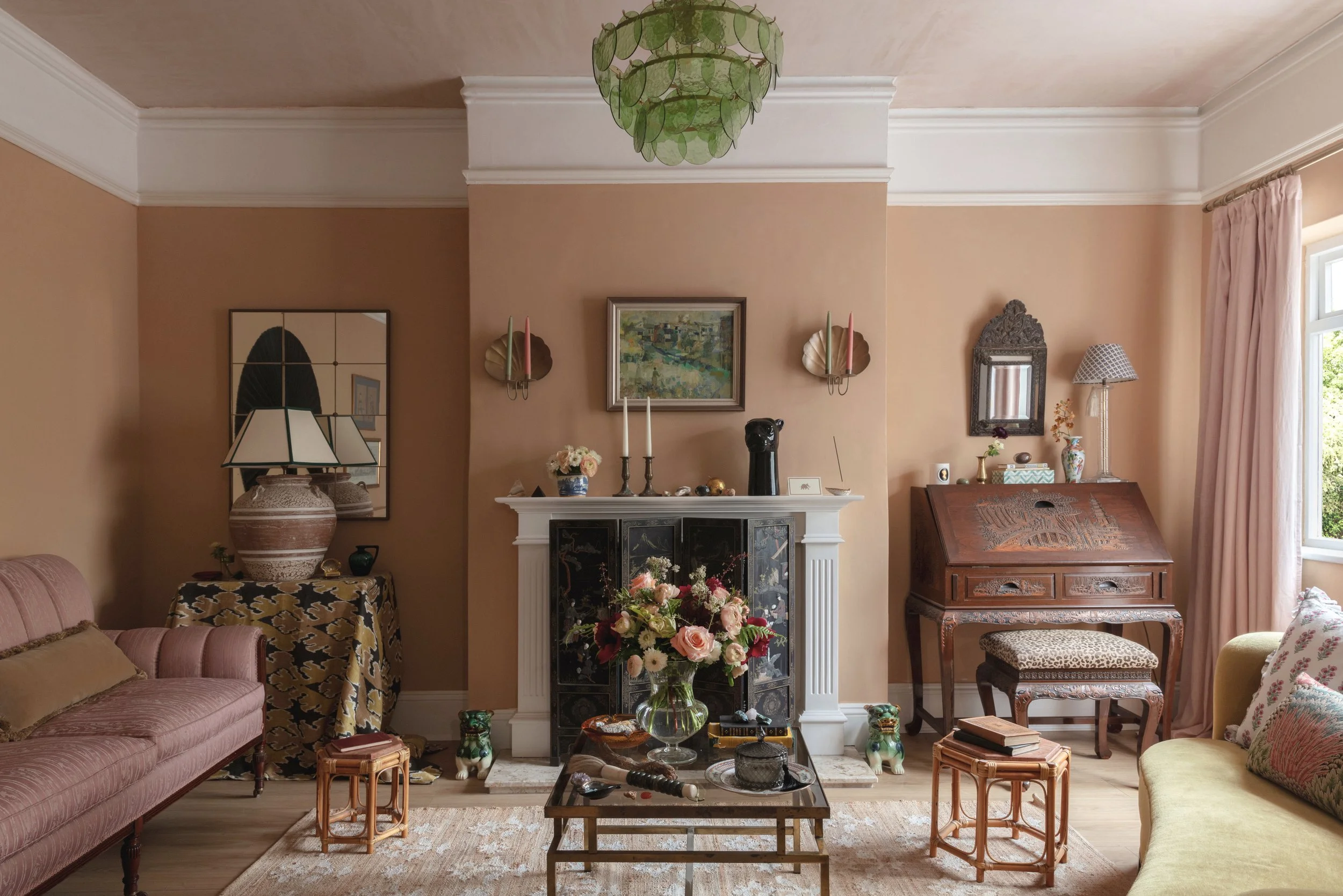
The Sitting Room


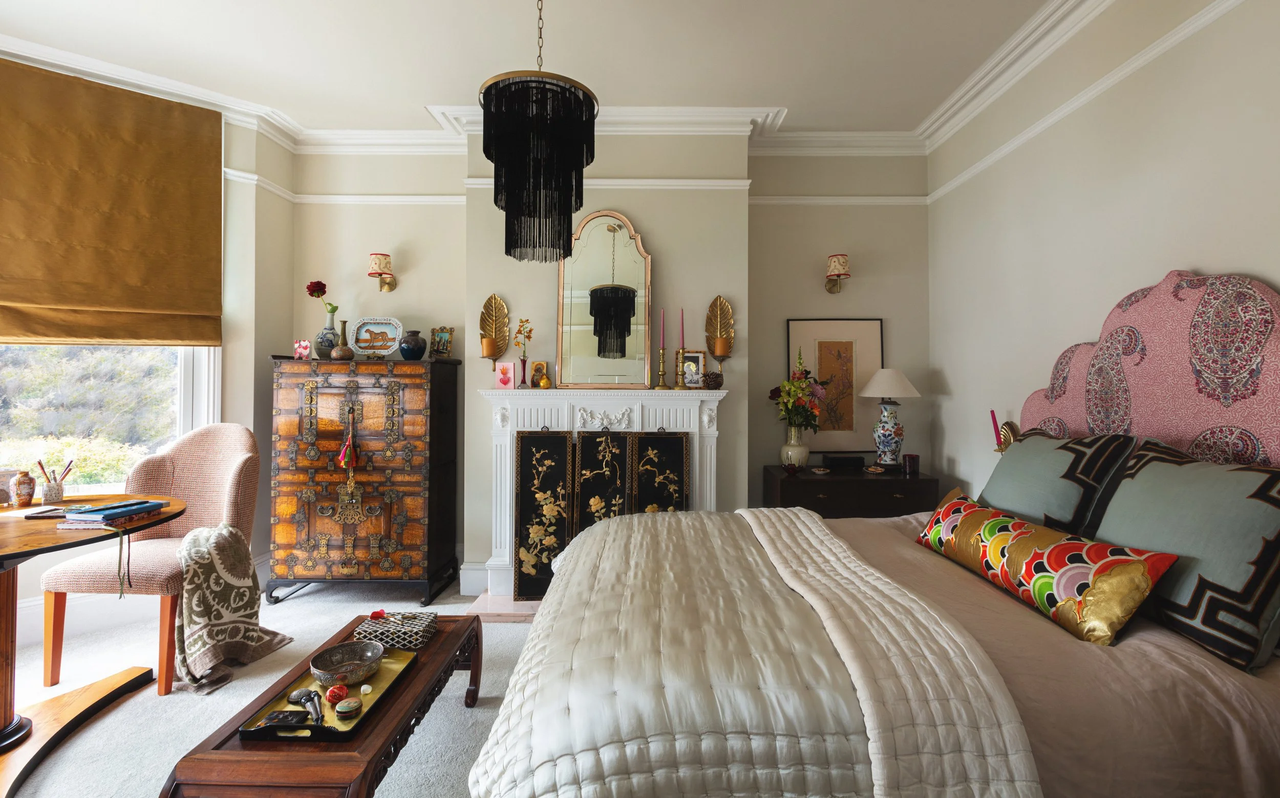
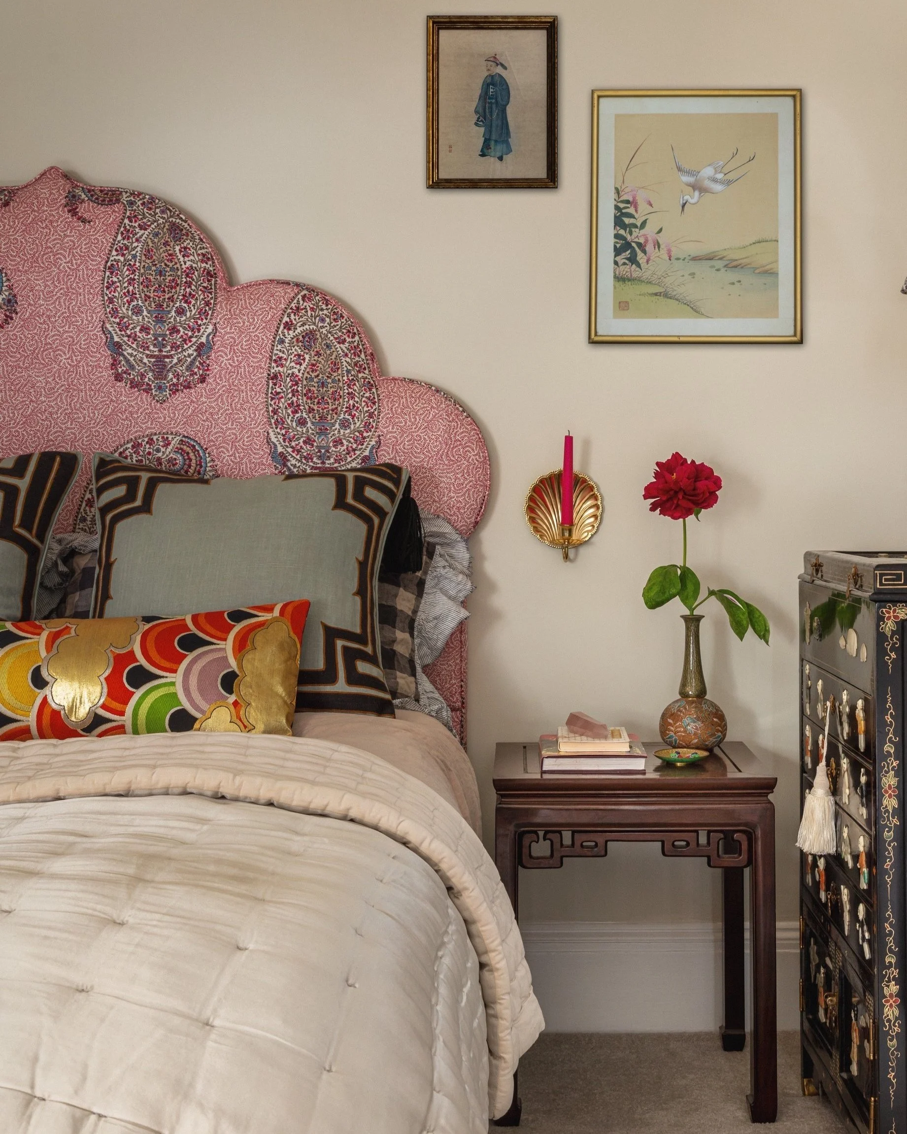
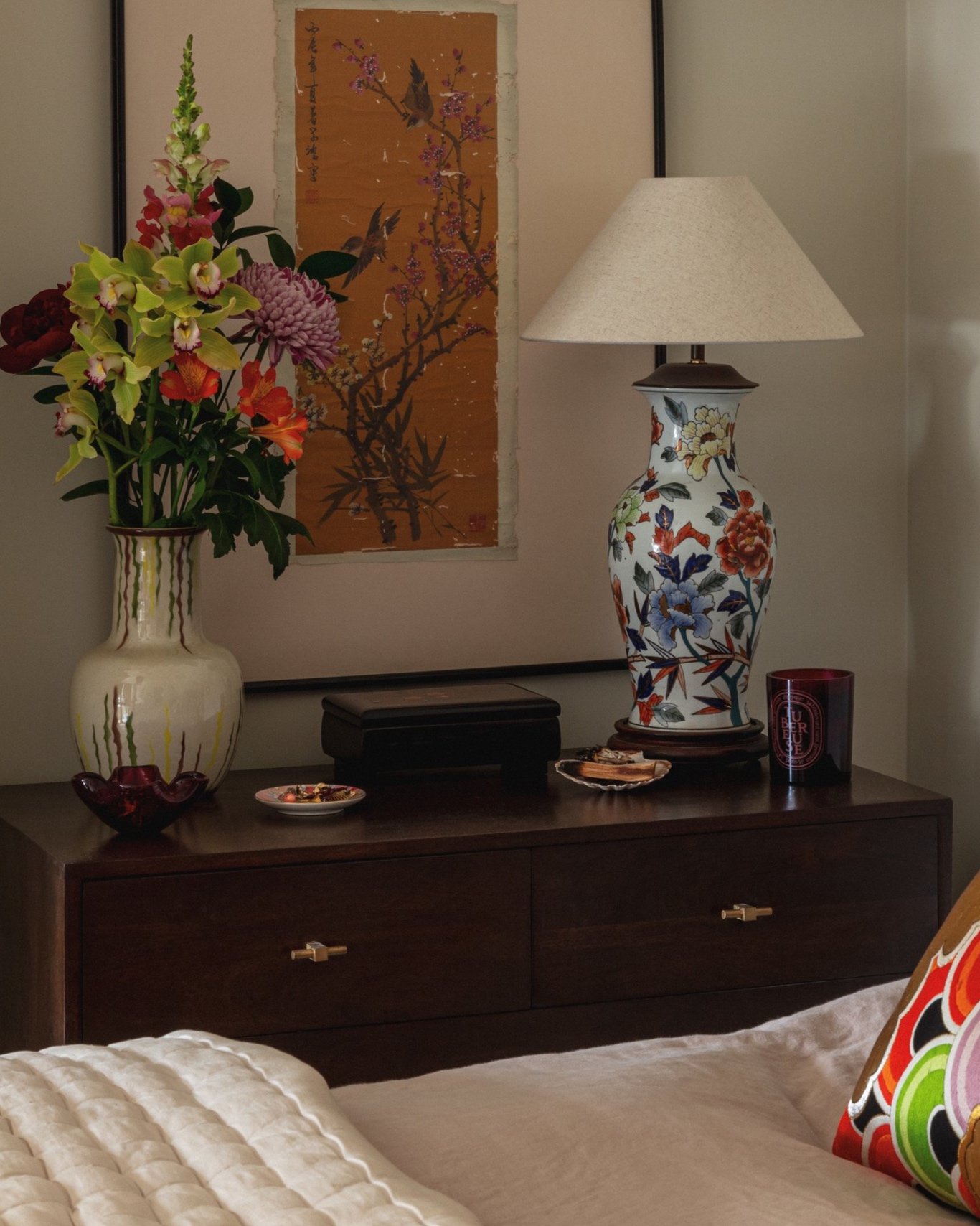
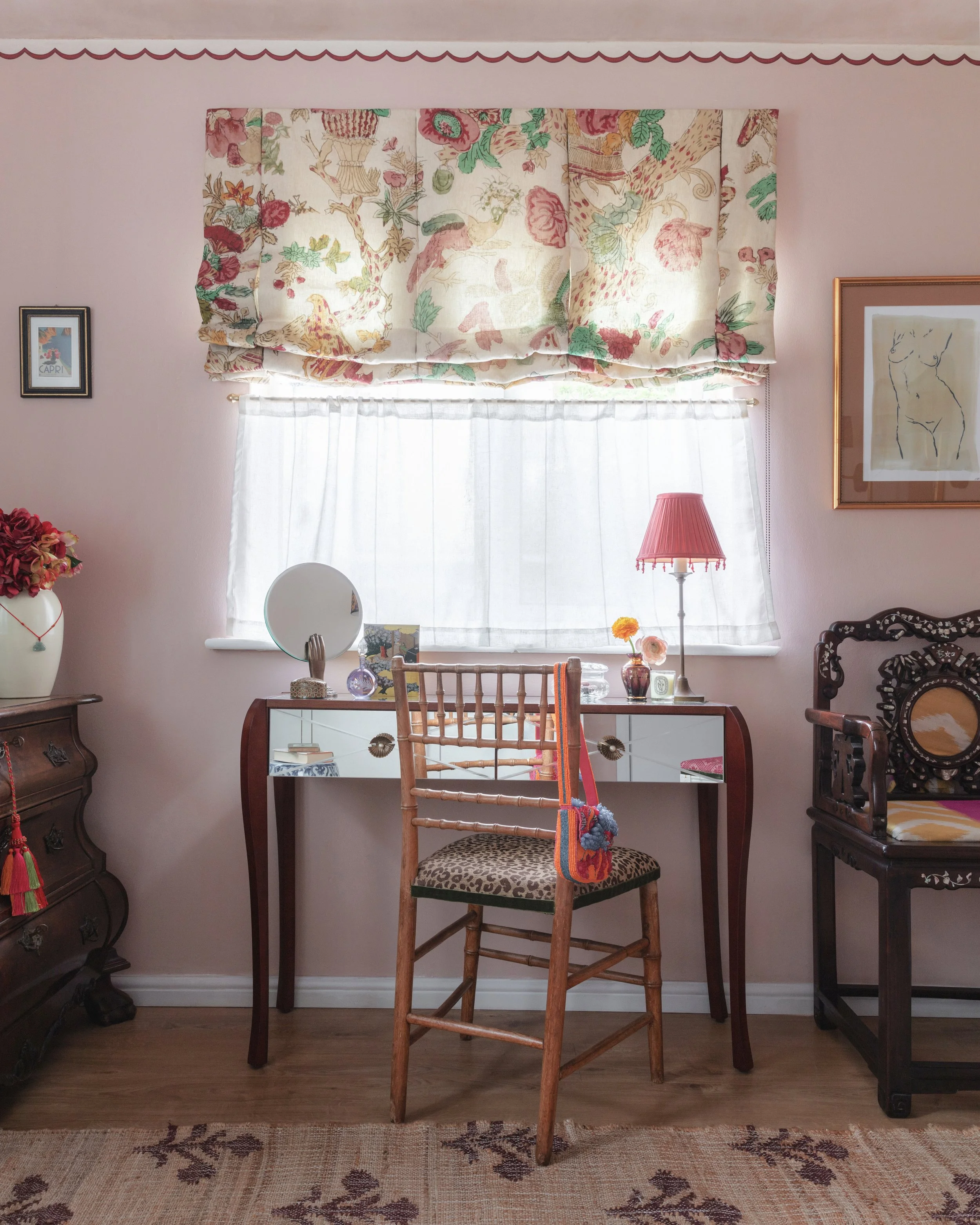
The Bedroom


CURATED COLLECTIONS

Embark on a journey with me as I reveal the backstory behind some of the personal pieces in my home…

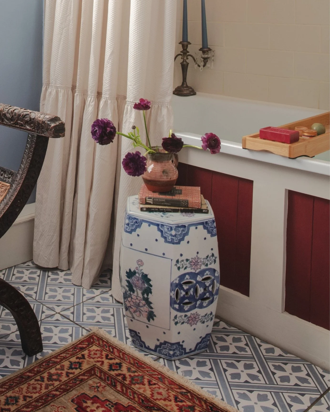
Indian chairs

These are colonial style teak wood chairs. My aunt who has lived in India and Pakistan has a beautiful collection of fabrics, carpets and furniture from her stints living in South Asia which I’m sure shaped my taste.


Chinoiserie stool

I’ve had this as long as I can remember as it was in my childhood home. It was designated my ‘special seat’ when guests spilled over and extra seating was required. A rather ingenious way my parent’s devised to get me to give up a comfortable spot on the sofa.


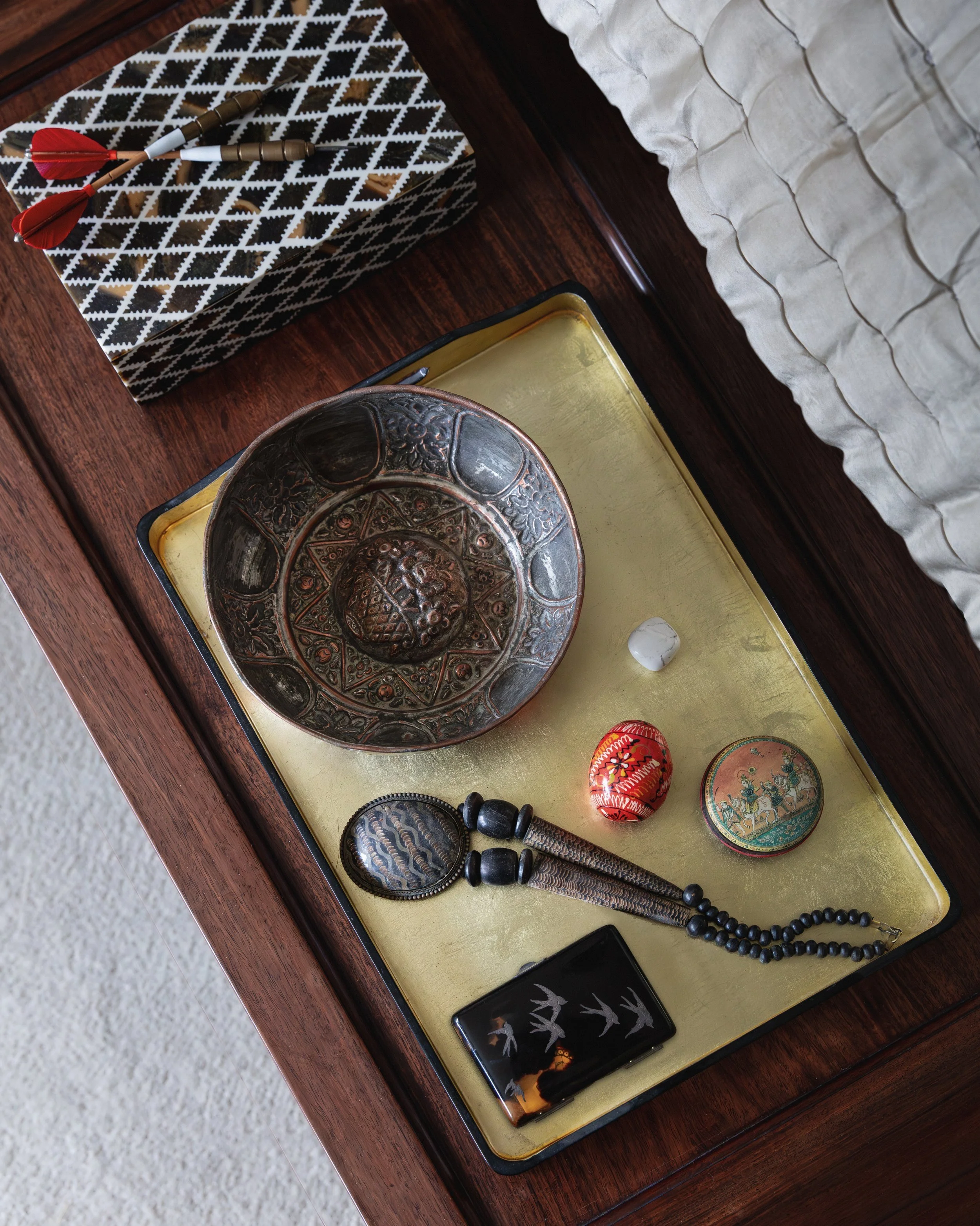
Hammam bowl

I’m slightly embarrassed to admit when I first saw the bowl I thought it was a vintage bundt cake tin but a little research revealed it’s true use was to ladle water over the bather in a hammam. The central indentation providing a pillow to cradle their head when turned upside down!


Arched headboard

 One of the influences for the Mughal shape is a row of Edwardian Anglo-Indian houses on the promenade in the seaside town I grew up in. They were a slice of exoticism next to one of my all-time favourite buildings, the clean lined De La Warr Pavilion. I love the contrast between them.


Oriental lamp

In truth, I don’t know too much about this lamp that caught my eye with its pearlescent lusterware glaze. It’s Imari-esque but not Imari. If anyone has any clues I’m all ears!


IN CONVERSATION WITH SOCIÉTÉ MAGAZINE

What are you working on at the moment?

We’re working on a handful of projects at the moment. The next to wrap up will be phase one of a colourful and expressive family home in Muswell Hill which has been a delight as the wife is a fashion stylist and is just as fond of colour and quirky details as I am!

We’re also due to complete a contemporary family home in Stoke Newington later this summer which has been an absolute dream project as it’s involved lots of collaboration with two super talented British cabinet makers, Jacob Alexander and Stuart Indge.

One of my key aims for the year was to support more British makers as it’s not only good for the environment but encourages future generations of artisans to continue to evolve their various crafts so working closely with these two South London based workshops has been a brilliant experience.

Which room in your new project, ‘The Hidden Pearl’ did you enjoy working on the most and why?

It would have to be my bedroom. It has beautiful light and feels super serene now but when I first got my hands on it I had my work cut out as it was a cacophony of 70s décor misdemeanours. So I rolled up my sleeves and got stuck in!

As it was the first room to be renovated it became my sanctuary during the refurb and contains some of my favourite pieces. One of those is the fire surround which I bought years ago. I’d been waiting for the right place to put it so installing it was a highlight and it’s become a focal point.

If you could design a room for any fictional character, who would it be and what would the room look like?

Ooh, this is such a fun question…In my own flat, especially the dressing room, I took inspiration from dusky film noir sets. ‘The Big Sleep’ being a favourite as there’s a heady cocktail of art deco and chinoiserie in some of the more overtly feminine rooms.

As a counterpoint, I’d design the bedroom of the male protagonist, private eye, Philip Marlowe. I’m thinking strong lines and art deco shapes but in a heavier more angular style. A simple backdrop with restrained use of bold colour on one or two key furnishings, perhaps a plush geometric rug, with an American art deco leather club chair in dark leather, a burl cocktail cabinet and bookcase to set the scene for sleuthing!


London Design Week ‘24

What a week! And what a perfect way to usher in the spirit of Spring. The Design Centre Chelsea Harbour is always full of inspiration but there’s something special about the buzz of seeing new collections and going to different talks that makes it a must in the calendar.

This year, I had the pleasure of sharing a few of my favourite LDW highlights in the countdown having recently featured in the ‘Ones To Watch’ edit of their VI Journal publication.

I also expand on my love for Collier Webb, specifically my personal connection to their new ‘Cedric’ collection. Named after Collier Webb’s founder, Cedric Collier, it’s inspired by rural Sussex, the county home to Cedric’s first small workshop and now their large foundry where each piece is meticulously handmade using old fashioned methods. It features walnut, a species of tree that has grown locally since Roman times, and cast, gently aged brass which to my eye gives it the perfect mix of elegance and rugged beauty.

Each light is named after a village Cedric held dear and given my own Sussex roots many of the place names evoke particular memories for me. Perhaps most of all, Cooden, the village my mum lived for many years which sits right by the coast and has a quaint Miss Marple feel with its low, wide, interwar houses, mock Tudor beachfront hotel, Tennis Club, Golf Club…and nudist beach (which may not be very Marple but seems somehow noteworthy!)


A few of my other favourites…

Birdie Fortescue’s beautiful rugs!

Eva Sonaicke’s eye-catching fabrics…(George loved them too!)

Ian Sanderson’s timeless Asian inspired fabrics

And more gorgeous rugs at Bombay Sprout!

Samantha Todhunter’s utterly elegant and girly silky seats.

Schumacher’s trimmings and Springy blooms!